Why are the instructions on medicine hidden away in such a ridiculously tiny font?
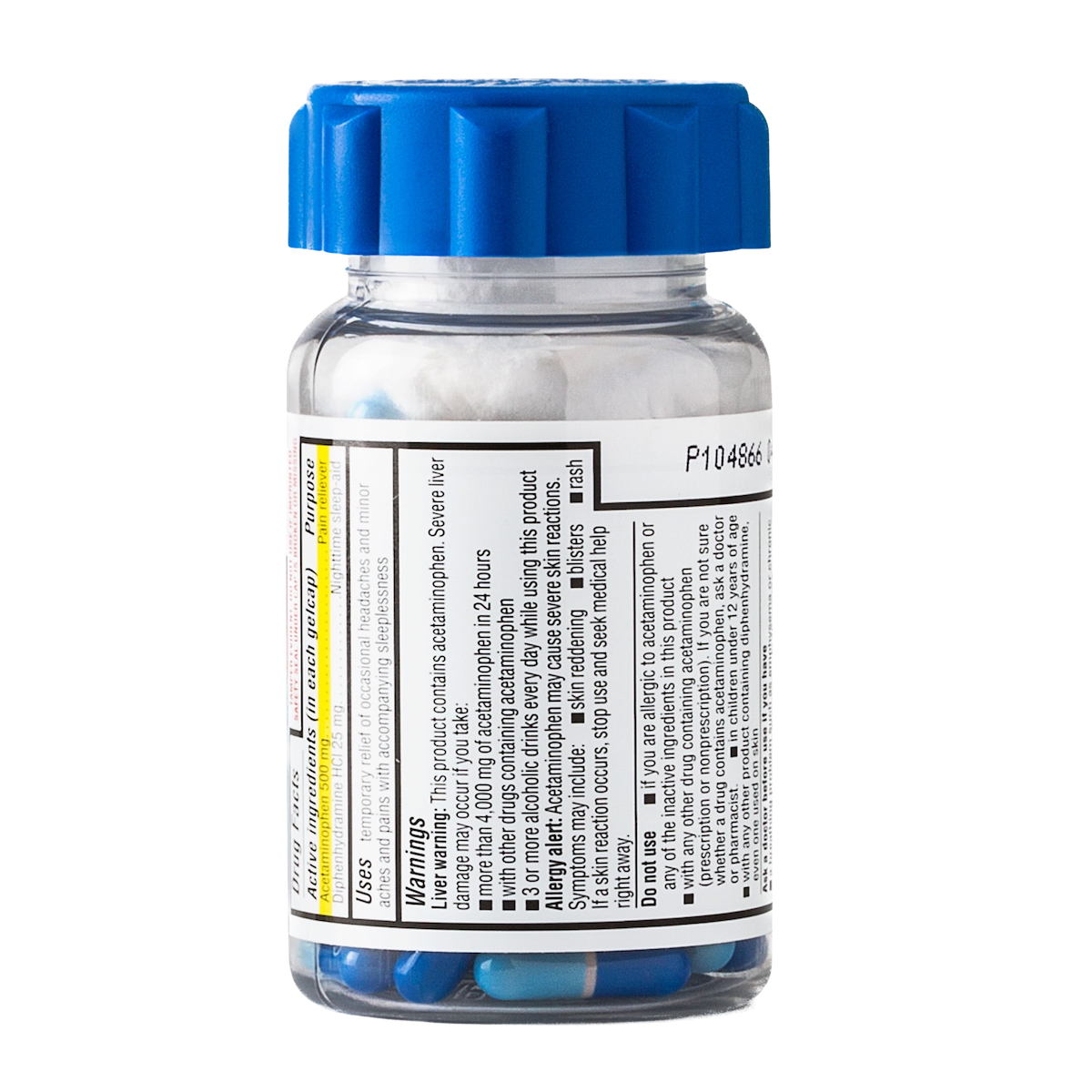
I get there’s a lot of information to showcase. But 9 times out of 10, people just want to know two things: How much to take and how frequently. Would it really be so hard to include “Adults: take 2 pills every 4-6 hours, Children under 12: take 1 pill every 4-6 hours” in a reasonable size font on the front or top of the bottle?
The last thing anyone wants is to be sick and squinting to make sure they don’t accidentally give themselves liver damage!